
Page 25 - Demo
P. 25
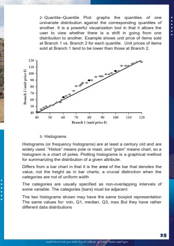
%u062c%u0645%u064a%u0639 %u0627%u0644%u062d%u0642%u0648%u0642 %u0645%u062d%u0641%u0648%u0638%u0629 %u0640 %u0627%u0625%u0644%u0639%u062a%u062f%u0627%u0621 %u0639%u0649%u0644 %u062d%u0642 %u0627%u0645%u0644%u0624%u0644%u0641 %u0628%u0627%u0644%u0646%u0633%u062e %u0623%u0648 %u0627%u0644%u0637%u0628%u0627%u0639%u0629 %u064a%u0639%u0631%u0636 %u0641%u0627%u0639%u0644%u0647 %u0644%u0644%u0645%u0633%u0627%u0626%u0644%u0629 %u0627%u0644%u0642%u0627%u0646%u0648%u0646%u064a%u0629252- Quantile%u2013Quantile Plot: graphs the quantiles of one univariate distribution against the corresponding quantiles of another. It is a powerful visualization tool in that it allows the user to view whether there is a shift in going from one distribution to another. Example shows unit price of items sold at Branch 1 vs. Branch 2 for each quantile. Unit prices of items sold at Branch 1 tend to be lower than those at Branch 2. 3- Histograms Histograms (or frequency histograms) are at least a century old and are widely used. %u201cHistos%u201d means pole or mast, and %u201cgram%u201d means chart, so a histogram is a chart of poles. Plotting histograms is a graphical method for summarizing the distribution of a given attribute. Differs from a bar chart in that it is the area of the bar that denotes the value, not the height as in bar charts, a crucial distinction when the categories are not of uniform width The categories are usually specified as non-overlapping intervals of some variable. The categories (bars) must be adjacent The two histograms shown may have the same boxplot representation The same values for: min, Q1, median, Q3, max But they have rather different data distributions
